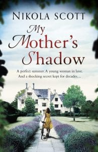
From the original book cover …

Last week, in a surprise turn of events, my publisher sent me a new cover for My Mother’s Shadow. Both covers, old and new, are stunning, both capture the essence of the book, but each of them hone in on a very different moment of the plot.
The old visual had a cooler feel to it and the colours and textures of lavender, lawn and leaves seemed to hold mystery and darkness. The perspective gave the impression of a larger tale and epic issue, in which the woman is only a small element. And she is still removed from it, walking towards it as if she herself isn’t yet aware of the mystery and ‘shadow’ that awaits her.

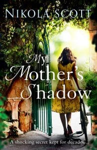
… to a very different viewpoint
The new cover, on the other hand, is much more intimate, focussing on this one lovely girl, captured in this one moment of time. It’s vibrant, sunny and warm, a lovely, leafy-green world, where an open gate is beckoning her — and you as the reader — into a world of sunshine and shadows, friendship and mystery, past and present. I love the colours and the focal point of the bright light on the other side of the gate, it’s so evocative and summery — and her dress makes me want to step right back into the 1950s.
All elements have to come together to create a cover that works
Detailed cover brief
Before a cover even sees the light of day, a cover brief and an excerpt from the manuscript give the designer a starting point for a visual. Anything from image ideas to thoughts on atmosphere and colour schemes can be included. In this case, we wanted to hone in on Liz and the country house in Sussex, so I supplied a variety of photos of both as inspiration.
Comparative titles — the same but different
In order to grab the attention of readers who love similar authors writing in this genre, the visual should lure them in via the familiarity of what they know they love, while adding new and different elements to avoid being derivative. A door or a pathway belonging to an historical building are classic elements for this kind of dual past-present fiction.
Readability vs layers
Nothing more frustrating than a cover with too many elements, unreadable type and conflicting messages. Because the first cover was so symmetrical and the colour scheme so clear, the type stood out immediately. This one, with softer edges and a lot of different colours, needed to be tweaked to get the type to pop. Finishes such as spot varnish and embossing will help readability and texture.
What it says on the tin
Readers want to know what they’re getting themselves into, so commercial covers tend to spell out clearly what category or (sub)genre the book falls into. No matter how beautiful a cover is, if it doesn’t fit the genre or doesn’t tell the reader immediately what kind of plot, cast and issues to expect, it’s not the right one for the book.
